
BCGControlBar Library for .NET
Ribbon Control
| BCGControlBar for .NET > How To > Ribbon Control |
How to
... add the ribbon to form
Select an element RibbonControl from the toolbox and place it on the form.
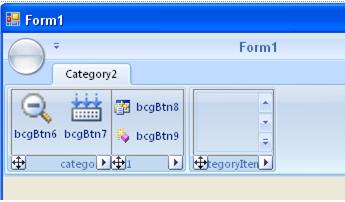
... add a category panel to the RibbonControl
Select the Ribbon Control in designer and choose "Add Category" on the property list.
... add a category item to the CategoryPanel
Select the specified category panel and click "Add category item" on the property list. The category item with a single active category item group will be displayed.
... add a CategoryItemGroup to the category item.
Select a category item and click "Add Vertical Group" or "Add Horizontal Group" at the property list. You can do the same using the context menu.
... add an item to the CategoryItemGroup
Select a CategoryItemGroup and select any object to add from the list of Commands located in the Property window. You can do the same from the context menu, which appears if you click on the button with arrow at the left bottom corner of item group.
... set initial collapsed state other than Large
By the default most of the buttons are added with CollapseState set to "Large". In this state the initial layout of the element will be "large button with text below". This button takes the full Category Item height. To fit more buttons into this space you can change MaxAllowedCollapseState property to "Intermediate" (show small image with text) or "Small" (show small image only).
Note: The designer displays all elements in maximal available state. They will be stretched to smaller sizes at run-time only. If Category Item Group alignment is horizontal, you can add only elements in "Intermediate" collapse state.
... arrange ribbon elements in several rows.
Add new CategoryItemGroup to the CategoryItem and add some buttons on it. Set the property Alignment for this CategoryItemGroup equal to ByLine. Select a button after which the next button should be placed to the next row and set a property Wrap = true for it.
Note: Category item group with alignment ByLine can contain only elements with CollapsedState "Intermediate" or "Small". If you add "Horizontal Group", the property Alignment will be set to ByLine by the default.
... create a Category item with one large button and some small button located vertically.
Add new CategoryItem to the CategoryPanel. Add two CategoryItemGroups on it. Set for the first CategoryItemGroup the property Alignment equal to ByColumn, for the second - ByLine. Add one button to the first CategoryItemGroup and some buttons to the second. For each button from the second CategoryItemGroup set the property Wrap = true.
... create a gallery
Select a CategoryItemGroup to add a Gallery. Add a new GalleryButton to the Ribbon by click "Add Gallery " on the property list. Create an image list and add it to the collection of images for one of the group on the Gallery. Select the gallery. Open a dialog box for GalleryGroupItem property and add a GalleryGroup to the collection. For this GalleryGroup specify the images by setting a value of property GroupImages equal the created ImageList.
By such way you can add others buttons to the Gallery. You should create an imagelist for every Group .
... make a Gallery resizable.
Select a GalleryButton. Set the value of property ResizeType equal to VertOnly or Corner. If the value is VertOnly you can resize the Popup Gallery by the bottom, if the value is Corner, you can resize a Popup Gallery by bottom-right corner.
... add popup menu items to the Gallery.
Select a GalleryButton. Open dialog box for PopupMenuButton property. Add some menu buttons to it.
... create a Gallery in popup menu mode.
Select a Gallery button. Set its property PopupMode to true.
... make a Gallery working in Menu mode
In the "menu mode" Gallery works as a regular popup menu, but this menu can be resizable, and can be split into several groups. Each group will display a non-selectable caption. To enable "menu mode" IsGalleryMenuMode property to true. You can set up the gallery in menu using the following properties: DrawCheckBox, DrawMenuMargin, ShowCheckedState, ShowPressedState.
Open editor for GalleryGroupItems property, add a group and add menu items (string) using collection editor for the GroupTextCollection property.
... handle Gallery events
Gallery events are fired for a ToolbarGalleryButton object. The most useful events to subscribe are ExecuteCommand and GalleryHighlightChanged. In both cases you need to obtain the last selected or highlighted gallery item. When you handle ExecuteCommand event, you can use SelectedItemIndex for this purpose. This index is a zero-based index in a flat list gallery items. Please note that group captions are also counted as items. For example, if a Gallery contains one group and user select the first item in the group, the SelectedItemIndex property will be set to 1.
When you handle GalleryHighlightChanged event, you need to get a reference to the gallery and take the ID of object referenced by the Gallery.HighlightedObject property.
... add and manage Context Categories
Select Ribbon control in designer, select the "Add ContextGroup" command from the context menu or from the list of commands located in the Property Window. A new Context Category Group will be added to the Ribbon Control. A Context Category Group contains at least one Category Panel. To add more panels to the group just select the Context Group object and execute "Add Category" command. To show or hide a Context Category Group with all its Category Panels just set the RibbonContextCategoryGroup.Visible property to true or false. Use the RibbonContextCategoryGroup.GroupColor property to assign one of the 7 predefined colors to a Context Category Group. A different color helps the user to make the difference between regular and context categories.
... add to application commands that are not in the Ribbon
You can add "standalone" commands using the "Not-In-Ribbon Items Editor". To open the editor select the Ribbon Control and run the "Edit StandAloneButtons" command from the context menu. You can add regular buttons, menu buttons, combo boxes and edit boxes.
... add commands to QAT at design time
Select the Ribbon Control and run the "Edit QAT" command from the context menu or from the Property Window. The dialog "Quick Access Toolbar Editor" allows to select commands from the list of commands that have been already created for the current application. Click the "Add" button to add a command to QAT. The selected command will be added to the "Quick Access Toolbar Items" list box. All added commands will appear on the QAT at the next application run. You can make some commands invisible at the startup by unchecking the "Make Item Visible" check box.
Note. QAT does not display these items at the design time.
... add application-defined pages to Customize (Options) dialog.
The RibbonOptionsDialog can be displayed by the library, but it contains only one "Customize" page out-of-the-box (for QAT customization). It's possible to add custom application-defined pages to this dialog in the following way:
- Create all the required forms serving as application-defined pages in the Options dialog.
- Add to each form a Panel control and set its Dock property to Fill.
- Put all the necessary controls to the Panel (s).
- Subscribe to the RibbonControl.ShowOptionDialog event. Set Handled flag to true to tell the library that this event has been processed and there is no need to show the standard Options dialog.
- In the event handler instantiate the RibbonOptionsDialog object.
- Set property RibbonOptionsDialog.ParentRibbon to reference to the Ribbon Control and the Owner property to reference to the form that hosts the Ribbon Control.
- Instantiate all forms that will serve as application-defined pages.
- Instantiate RibbonCustomizeForm.
- You may want to set up a custom Paint handler to draw page header. You have to do that before a form has been added to the Options dialog.
- For each form instantiated in steps 7-8 call RibbonOptionsDialog.AddForm. This method accepts a reference to a form and a name of page. This method takes the panel with Dock property Fill from your form and moves it to the Options dialog.
- Use the RibbonOptionsDialog.SelectedObjectIndex property to activate the desired page.
- Subscribe each form to RibbonOptionsDialog.OkClicked event to be notified that the user confirmed his choices.
This technique is illustrated in MSOffice2007Sample demo.
Note. The name of panel taken from the RibbonCustomizeForm is _customizePanel. You may need to specify this name in order to set up a custom Paint handler.
... create large and small menu buttons for one popup menu
To create a large menu button just assign a large image (32x32 pixels) to the LargeImage property. The menu margin is not drawn for menu items with large images. Large and small menu items are separated automatically by separators.
... create a large menu item with multi line text (description)
Create a large menu item as it's said above and set ShowTextWithDescription property to true.
... edit the Main application menu
Select the Main button and fill the application menu by large menu buttons. The main application menu may contain two levels only.
... add option buttons to the Main application menu panel
Select the Main button and choose the "Add OptionButton" command.
... add and edit Status Bar Control
Drop the RibbonStatusBar control to the form. Now you have an ability to add status bar panes, button groups and track bar control to the regular and extended areas of status bar. Status bar elements fire ExecuteCommand events as any other regular Ribbon elements. Double click a status bar element to add an event handler.
... add command buttons at the right side of context tabs (buttons located at the right top corner of Ribbon Control)
Select the Ribbon Control and execute the "Add TabButton" command.